Fun for everyone." ― Satoru Iwata

Develop a brand identity for the franchise, Casa Mas 'O'—including a logo, stationery that includes business cards, packaging, signage, and menu—and educate Zoe Casmento on the importance of using the creative team’s established brand identity guidelines to promote the restaurant and the franchise opportunity, through a brand identity manual.
Although I've created Identity Branding for various other clubs around my University and departments, this was the first in-depth, professional branding identity that I created. Creating a logo wasn't foreign to me, but creating a consistent theme throughout all aspects of an identity manual was new to me.
The concept of not adding faces to an individual makes one seem ominous, mysterious and encourages the viewer to question the individual's identity, or lackthereof. I took the two main characters, who play a large factor in judgement in the series, and removed their faces. The concept of dolls is often used throughout the series, along with an audience, so I wanted to incorporate those strong themes as well. One of the main characters plays the role of the "judge," and so I posed him to make it seem as if he is a puppeteer, in control of people's lives. The other main character in the series is a human being, who eventually sways the other main character into developing human emotions, making it difficult to pass judgement. All these factors pushed me to pose the other main character as a puppet, which holds true to the series progression, but leave the audience questioning on what was going on.
Find a low priced small packaged product (ie. bar of soap, toothpaste, gum, or candy bar) with a potential to be re-designed. Create new package design for the existing product including the name and logo for a product of your choice.
I chose to re-create the Beauty Blender, a product that I've used for years and am an avid fan of. The Beauty Blender comes in a clear, plastic tube, in order to keep the rounded Beauty Blender straight up. I wanted to re-create the Beauty Blender in a different light and create a packaging that would suit that image. However, it took me a while to consider what theme I wanted the Beauty Blender to represent. The normal product comes in pink, beige and black--there isn't a specific theme to it.
I decided to take advantage of the unique shape of the Beauty Blender. It's reminiscent of a droplet, so I wanted to relate that to water as one would typically dip their Beauty Blender to soak in water. Instead of the neon pink color, I went with a light blue color for the body of the sponge, with darker blue "droplets" near the tip. The tip of the Beauty Blender is used the most, so I didn't want makeup to stand out as much on a lighter blue color as opposed to a darker blue. The logo was designed with the concept of a water droplet falling into a pool of water, and I added Beauty Blender's iconic tagline--"an original beauty blender."
Design a logo for an upscale Italian coffee and pastry shop. The shop sells and serves specialty coffees such as cappuccinos, lattes, and espressos.
I worked with the Residental Hall Council in planning for this event. However, we had some setbacks about the time and had to cut a few of the activities out. For example, we wanted to give out custom t-shirts with a Mohawk Logo that I created; however, weren't able to do so because of time constraint. So, when prompted to create a flyer for this program, I was nervous because I didn't want to falsely advertise a program.
I took what I knew was 100% going to occur--sports, some food and most importantly, socialization between the residents. I wanted the flyer to pop, so I used bright colors in contrast with a black background. Neon colors, such as greens, reds, and blues really helped attract the eyes of residents passing by. I kept the words and advertising vague, just in case something were to occur that we could not commit to.
A new entry into the shoe market, this brand is made of 100% Italian leather. Consumers can purchase them in retail environments or online. The brand shoe designer is a highly acclaimed designer but does not want to lend his name to the shoe; instead, he wants a name that will attract the youth market/trendsetters.
I got stuck on the concept of wanting to tie in laces of a shoe to the company's name--"Laced Up." I went through several drafts of creating a logo that would appear to look like a shoe with the company's name. However, those attempts were futile due to the typography not reading out "Laced Up" well. I had to scrap my original idea of making the words of "Laced Up" appear as a shoe for a logo.
After scrapping the intitial concept, I decided to focus more on the theme of the logo. I decided to create a logo, using shoe laces, to spell out the words "Laced Up." The laces on the shoe would be a blue, contrasting to the white shoe. Overall, I created a logo that embodied what I wanted to stand out in the company--their brightly colored laces.
Design a logo for an environmental, conservation organization that works to promote environmental education and charitable giving through individual and corporate donation campaigns.
This new nonprofit organization is aimed at environmentally concerned citizens (men and women ages 23-63), as well as corporations who are “green”-minded.
I wanted to create a unique environmental logo, as most of the existing environmental logos incorporate hands forming into a tree. Trying to come up with a unique concept that coined "togetherness" and "environmental friendly" without dipping into existing designs was difficult.
I incorporated the typical concept of "togetherness" with the hands and "environmental friendly" with the trees, but instead of forming the hands into trees like most designs do, I wanted the hands to become the base, or "soil" for what they would create. Essentially, the two hands would represent people and the heart shaped tree would represent the efforts they put into an environmental friendly organization.
Design a logo for a new brand of handmade blended beverage similar to smoothies. The beverage is made with milk, fruit, and ice and is made by a company called Liquados. The beverage will be sold in the refrigerated section of the grocery store. Make sure that your logo commands attention! This drink is aimed at teens and young adults.
For a fruit/smoothie beverage, I wanted to use bright colors to draw in the eyes--but of course, not unnatural colors. I also wanted the logo to immediately convey at first glance what the company was trying to sell. Various other pre-existing fruit juice logos have their logos conveying a smoothie on-the-go, or a smoothie in a glass container. However, because this was a packaged juice, I wanted to stray away from the "on the go" type of design, and focus soley on selling that the juice blend would be healthy, juicy and have a variety of tasty juices.
I decided to use various sliced fruits facing a cup, with a negative space water droplet and a cup. At the far left, I added some leaves, as if the entire logo was itself, a fruit. For the packaging, I used the bright, fluorescent colors in the fruits to create a brightly colored splash. I didn't want the packaging to be overwhelming, so the bright colors were used in the smaller, more subtle droplets.
To create a logo for the organization, the Club Funding Board with a satirical twist, dubbing it the "Club Freezing Club."
I wanted to create a professional logo that could be used in silly situations as well. Due to the logo being a work of satire, I wanted to truly emphasize on the freezing portion of the title, as it has such a strong meaning--both at our Student Government, as well as in imagery. The biggest issue there was figuring a way to convey that without being too cheesy.
Looking for a source of inspiration was my first step; something icy, frozen or melting was where my mind wandered first. I thought about ice cubes and how they were frozen, yet could melt. I created a vector image of the cubes, which dripping patterns underneath.
To create an attractive, modern logo for the Magic The Gathering Club at SUNY Polytechnic Institute.
My biggest concern was my lack of knowledge on MTG, so it was difficult to begin creating a concept for an appropriate logo. However, I refused to give up because it was a request from the President of the club.
I opted to borrow a magic card and slowly pull elements from the back of the card, the symbols, and other small details. I did some research on how to play MTG to get a better understanding of the overall game. In the end, I produced a logo possessed strong elements from the series along with the physical cards themselves.
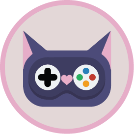
To create a name and logo/mascot for an imaginary elementary school or non profit organization.
I’ve designed several logos for varying courses, organizations and clubs; however, the concept of a mascot was foreign to me so I was concerned about how I should approach the project. I opted to use one of my favorite animals, a cat, and turn it into something that could be iconic. I didn’t want to use a variety of crazy, bright hues so I also considered using a monotone color palette. The biggest hurdle I had in this project was how exactly I could turn a simple cat into an iconic piece.
I chose to go for a sleek, quiet and cunning feature as most felines possess similar characteristics. I chose purple as the main source of my colors, as it symbolizes royalty and maturity. In creating this mascot, I also wanted to make it “iconic” and one method of doing so was to mimic a chess piece from the shoulder up. I added varying shadows of darker purples to make it appear as if the cat was looking away from the viewer. One of my favorite features of this piece was how I incorporated the colors within the cat into the word logo—“Katrina Highschool.”
To create a new logo design for the Student Organization, The Factory Times. The Factory Times is the University's official magazine. I wanted to incorporate a new, modern design for the magazine.
I wanted something that was reflective of the University's magazine. The previous logo emphasized creativity, with splashes of paint. However, I wanted a new, modern take on creativity and I also wanted to incorporate our University's colors--blue and gold.
I incorporated a pen vector into the logo, as The Factory Times is a magazine and has writers as well as designers. Instead of a gel pen, I decided it would leave behind a thick, golden path; this was inspired by calligraphy. I thought the use of typography made the logo clearer and overall more professional.
To create a new logo for Poly Pride, the University's LGBT+ club.
I wanted to incorporate the colors of the LGBT flag in a creative manner. While a flag or a heart is typically the shapes that most LGBT+ clubs use, I wanted my design to be more creative.
I ended up using a hand for the logo, as I quickly realized that I could create a heart shape outline with our fingers. I took the negative space and played around with textures and the colors of the LGBT+ colors.